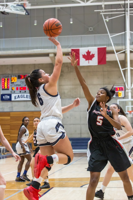
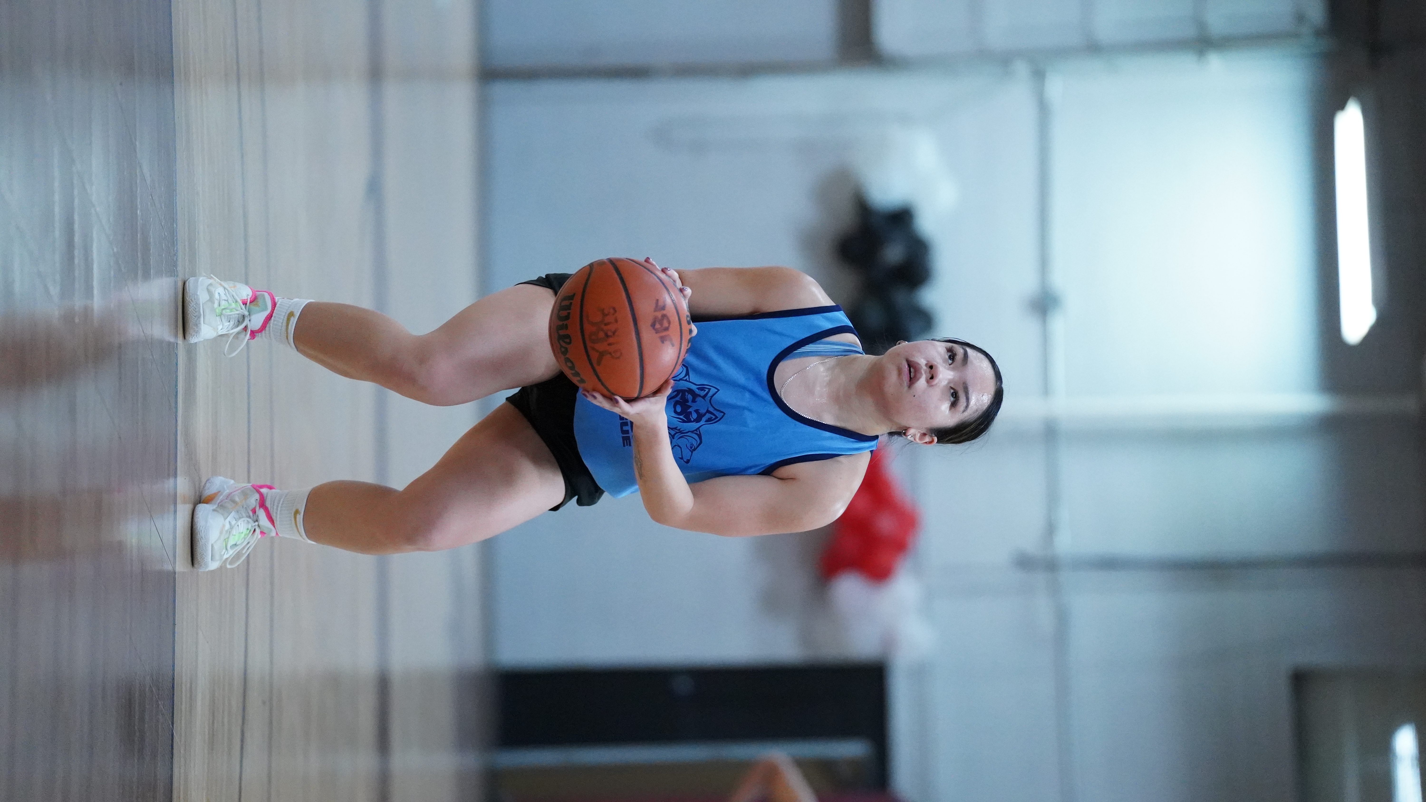
Process

The Making of Basketball Chronicles of J.V

Jan takign a foul shot

Rationale

When deciding about what kind of portfolio to create for this project, I thought of my greatest achievements and the points in my life that has shaped me into the person I am today. I knew right away that basketball would be a good portfolio to showcase to future professional teams and coaches as I aspire to professional basketball one day.

I named the website, "Basketball Chronicles of J.V" because I wanted to present my experience and journey of my basketball career as a story that my users are reading. This is the same reason why I wrote my content for the website in first-person so that my audience can feel like they are getting to know me personally.

Jan running down the court

Steps

I wanted to have a very simplisitc look to my website so that the target audience can directly go to the content that they want to see right away. I made sure to start off with my navigation and footer so that I can apply it to every page on the site. Afterwards, I wanted to follow the same kind of format thorughout the website, such as having a jumbotron as the first thing users see on each page. The consistency makes it easier for users to navigate and is also aesthetically pleasing to the eye, making it less chaotic.

  • My landing page was a welcome page that users would encounter when they first come to my website. It shows a picture of me, a welcome blurb, and my signature. If users want to continue throughout the website, they can scroll down and find previews to what the other pages are about.
  • The about page was a content-rich page that is telling who I am as a basketball player (i.e. my position, my experience, what I want to do next, etc.). I wanted this page to have lots of content on it in terms of explaining my experience, awards, and achievements. I did not want a lot of pictures on the page because I wanted more explanation rather than a media-based page since it is important to have context behind them.
  • Showcasing basketball involves lots of media-rich content, and so I wanted to have a media page that has picutres and videos of me playing basketball. This would be important for my target audience because in order for them to be interested, they have to see my skills in action.
  • Finally, I wanted to include a contact page for users to send a message, and follow me on social media for more content. This is important for my target users who would be potential coaches and teams who may be interested in having me play for them. The page also included a references section where I give credit for all resources that helped me create the website.
Jan going up for a layup in red shoes

Colour

For the colour palette, I went with a black and white scheme because I knew that my website would be more on the media-heavy side of content. Black and white was a good way to make text and other content pop. If I had used more dynamic colours, I feel that it would have clashed with my colourful photos.

Jan shooting a three pointer

Typographic Studies

In terms of typography, I know I wanted my text to stand out and have a modern feel to it as I knew there was not going to be a lot of text needed for the website. In the article, The 7 Best Modern Fonts for Websites, Justin Morales compares the sans-serif and serif fonts (Morales, 2021). Morales explains that serif fonts are easier to read in a smaller copy, while sans-serif fonts stand out in bold titles as well as giving off a modern feel (Morales, 2021). Therefore, since I know I wanted my text to stand out, I mainly used sans-serif for all text on my website. Although I could have used a serif font for the content on my about page, I felt that it was not consistent with the overall feel.